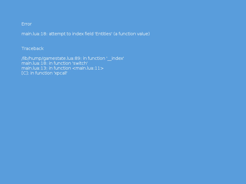
Another day, more progress...
Three more screens done. Not so happy with the illustrations for these, but for the moment they will do just fine.
The image I was going to use looked terrible when I had inverted the illustration so I had to find another short notice. Will probably replace this sometime down the line.
See I gotta save the running illustration for the run stat, so I was at kinda of a loose end on what to use..
The demo is going just fine. Should be done by tonight the way things are going now thanks to all the help I got last night.
My projects and demos
Re: My projects and demos
And here is the fourth screen...
Your notice that I have completed these last few out of order, I still need to get a few more images to cover the missing screens. But its all going swimmingly. Have tracked down a number of sound effects that will be used in the game.
And this is the fifth - As you can see the further in we go the more simplistic that the characteristics get. There is some debate how much information a player really needs - some would say you should tell them everything so they can optimise there character build. Where as others believe that a player should only know just enough to be able to play. I figure if you give people a choice. Then your casual guy/girl can play the game and not go into the kind of nitty gritty detail that a person seeking to optimise there character build would.
The sixth screen - Body type is actually the parent statistic that the lift and carry stats are derived from. There is more information to present, how I plan to do that is have 1/3 2/3 3/3 and have a different button/key selection to access the next page. But for now the first page is ok till I get the rest of the stats finished. Will come back and add in the rest of the info later.
Re: My projects and demos
Doing six screens in one day sort of broke me lol. So I wanted to do something a little different but was still on the todo list.
Anyway - here is the first attempt at an inventory screen.
Initial ideas on how to implement this, just use a table of tables, each square is a table and each item has a area value - when a player tries to place it into the inventory its just a simple calculation to see if there is enough space or not. Thinking of what to put on the bottom bar, probably a macro/quick hub where people could put the actions/macros they want. (like warcraft)
Re: My projects and demos
Today, finally bit the bullet and started to split the screens into more rational parts.
Bar, menubarframe, mainframe, background ect.. this will greatly reduce the size of the assets. But to keep from having to do annoying scaling calculations and positioning functions I figured I would be a little lazy and save this trouble by just having each asset have transparency for the whole of the display (example, the menuframe has a size of 1600x1200, same as all the assets.) That way I don't have to do any kind of positioning calculations.
What prompted me to do this, besides not wanting to mess with figuring out a for/while loop to generate the menubar along the bottom after it had been scaled to the screen size the user wanted. (not as easy as I first imagined because you won't necessary have whole numbers to work with..)
Having messed around with a pretty crappy for loop, I had breakfast and suddenly it occurred to me that perhaps a png file would handle transparency in a optimised way. So I could cheaply keep the position of each asset without too much memory overhead.. thus solving my positioning problems while at the same time still making a big win with the file size..
As a sanity check I did a test to see just how much I was saving by not keeping the whole page resolution on the buttons... it turns out for all that extra work I was getting a whopping 7kb per button saving.. now that would give me a total of 13x7kb... 91kb for all that extra coding and headaches.. I figured I would go the easy route and take the 91kb hit in memory over the time and effort that manually positioning the assets would take..
So that's why the demo is no live yet.. once the assets are in a fit state, it will go up. at a significantly smaller file size.
So most of the screens are now in the new format - the largest png file is 386k vs 1.2mb before. And that was the worst case, most of the screens are coming in around 90-150k... So that great
To see what I am talking about ..
So yea I could use fonts to render the text, but that starts to get very strange when you are scaling and the numbers go into fractions, it also ends up with headaches with positioning over different resolutions. So I found it just easy to "bake" the text. I don't have to worry about positioning but on the other hand - how often am I going to change that text? hardly ever. If I need to once in a blue moon alter the text in a deep sub menu I can just go into inkscape and do that. Or later down the road just write a script to do this - follow my logic here. The inkscape save file is basically a xml file. So I should be able to go in - find the text xml tag in the file and just update it from a script. There is bound to be a way to run a command line export from inkscape and there you have a update able workflow. The only issue is that inkscape save files while being xml files are massive. So trying to figure out in a text editor usually crashes my laptop. but that's more a case of my laptop being old and not the idea I think.
Update:
This is totally feasible. - I was just using the wrong text editor lol. The inkscape files can be edited outside of inkscape and the text updated. So this opens the door to batch upgrades of assets from a masterfile. Making asset generation/revision trivial. This solves a big potential headache if I wanted to at some later date go back and extensively revise the text in the menu screens. It's literally just editing the contents of a XML object.
To get inkscape to generate the png file after the svg was uploaded from a script you can do the following..
works just fine. For the moment I will just eyeball the XML tag location in the svg file and use awk or sed to update the text.
All in all a good days work.
Not sure about the size saving you get from taking the text out - probably a fair amount but vs the potential for mayhem with rendering the fonts its probably a fair tradeoff.
Bar, menubarframe, mainframe, background ect.. this will greatly reduce the size of the assets. But to keep from having to do annoying scaling calculations and positioning functions I figured I would be a little lazy and save this trouble by just having each asset have transparency for the whole of the display (example, the menuframe has a size of 1600x1200, same as all the assets.) That way I don't have to do any kind of positioning calculations.
What prompted me to do this, besides not wanting to mess with figuring out a for/while loop to generate the menubar along the bottom after it had been scaled to the screen size the user wanted. (not as easy as I first imagined because you won't necessary have whole numbers to work with..)
Having messed around with a pretty crappy for loop, I had breakfast and suddenly it occurred to me that perhaps a png file would handle transparency in a optimised way. So I could cheaply keep the position of each asset without too much memory overhead.. thus solving my positioning problems while at the same time still making a big win with the file size..
As a sanity check I did a test to see just how much I was saving by not keeping the whole page resolution on the buttons... it turns out for all that extra work I was getting a whopping 7kb per button saving.. now that would give me a total of 13x7kb... 91kb for all that extra coding and headaches.. I figured I would go the easy route and take the 91kb hit in memory over the time and effort that manually positioning the assets would take..
So that's why the demo is no live yet.. once the assets are in a fit state, it will go up. at a significantly smaller file size.
So most of the screens are now in the new format - the largest png file is 386k vs 1.2mb before. And that was the worst case, most of the screens are coming in around 90-150k... So that great
To see what I am talking about ..
So yea I could use fonts to render the text, but that starts to get very strange when you are scaling and the numbers go into fractions, it also ends up with headaches with positioning over different resolutions. So I found it just easy to "bake" the text. I don't have to worry about positioning but on the other hand - how often am I going to change that text? hardly ever. If I need to once in a blue moon alter the text in a deep sub menu I can just go into inkscape and do that. Or later down the road just write a script to do this - follow my logic here. The inkscape save file is basically a xml file. So I should be able to go in - find the text xml tag in the file and just update it from a script. There is bound to be a way to run a command line export from inkscape and there you have a update able workflow. The only issue is that inkscape save files while being xml files are massive. So trying to figure out in a text editor usually crashes my laptop. but that's more a case of my laptop being old and not the idea I think.
Update:
This is totally feasible. - I was just using the wrong text editor lol. The inkscape files can be edited outside of inkscape and the text updated. So this opens the door to batch upgrades of assets from a masterfile. Making asset generation/revision trivial. This solves a big potential headache if I wanted to at some later date go back and extensively revise the text in the menu screens. It's literally just editing the contents of a XML object.
To get inkscape to generate the png file after the svg was uploaded from a script you can do the following..
Code: Select all
inkscape -f FILENAME.svg -e FILENAME.png
All in all a good days work.
Not sure about the size saving you get from taking the text out - probably a fair amount but vs the potential for mayhem with rendering the fonts its probably a fair tradeoff.
Re: My projects and demos
"Yay! may Pilipino na din dito! yata..? Hahaha"
Whoa, that looks like a lot of work has to be done. Seems that this project would be a great one if it became finished. Wonder if it would become a 3D one! (though 3d is not fully implemented in the engine... but some few demos did)
Looking forward to it's completion! (or at least a demo) Great job, Pogi! xD
Re: My projects and demos
Hindi po, si foreigner ako, conting tagalog only haha.
If I ever got a new computer with a decent graphics card (the laptop has only a on-board one, so most 3d rendering/engines wont be supported..
Plus 3d is a bit of a steep learning curve from what I have observed. I saw some great technical demos about doing 2.5d in lua but they seem a bit beyond my reach at the moment. So I will just focus on doing a top down dragonquest style over-world with menus for the town hubs. That seems more achievable for one person I think.
The hardest part is going to be implementing stuff like the NPC AI, path-finding ect.. but there is a lot of previous work done on these problems by others I can study. Figure tackle each part as its own independent module and build it up step by step. The menu is close to completion now. So once that is done I will have that in its own module. Then next on the list is implementing the town hub. once that is done, over-world, then dungeon.
One fun thing I want to try is getting a shape file to be used as the base template for a tiled map. But that is something for when I get on to building the over-world.
One thing I am also doing is creating the tools so I can update that module either from a script or using a tool - so I don't have to remember exactly how I implemented each part to make changes later down the road. That should stop a lot of needless heartache later If i need to go back and change something months down the line.
It adds a bit of overhead to the project but I think overall its a nice compromise to finish with a set of tools that give you the ability to reuse what you wrote for other projects ect..
Re: My projects and demos
Some progress - managed to get all of the hump libraries working. While I was playing with hump.camera I seem to have solved how to centre the screens while in full screen mode. But this messes up the windowed mode. But its halfway towards a solution.
The timer library is pretty straightforward - even I could figure out how it worked first time (hooray!) Prepare for intro/outro screens to appear shortly in the demo. It slowly dawned on me how useful this would be to 'fake' game AI for things like the NPCs and the shops when in combination with the signal library.
Most important is the gamestate library - I can now start to split the program into its parts.
The signal library will become more useful in the actual game portion, but for now that will be used in handling the pause functionality.
The library that caused the most headaches so far was camera - mostly because I was too dim to figure out the coordinates ect.. Still I was happy that I was able to centre the screen in full screen mode. Just now I can't seem to get it to update to windowed mode. I get a feeling I am missing something obvious with that. But will think about it more and play further. Needless to say had fun getting the screen to rotate various directions and zooming. I can see this being very useful in the game. Also the possibilities of doing a 'split screen' section become more fees able now as I guess you could generate more than one camera and put it on the screen. That expands greatly the possibilities of what could be done in terms of interface in the game if possible.
The only library I didn't get to look at but appears to have loaded just fine is the vector library. Don't really see me doing much with this till doing the main game state.
Just glad everything appears to have loaded right this time compared to the previous headaches loading libraries. I think perhaps it was because I was loading assets from a zip file last time or it could be that I was using require with the . instead of /..(UPDATE: Yea I know this is a bad practice - have switched it back to using the . and it still works fine. So it tends to point to it being something bizarre happening when I was messing with assets in a zip file.. beyond that I have no idea what was causing the problem before... Phases of the moon?) anyway will soon find out if the assets being ziped are what caused the pickle last time.
Update:
Today was spent mostly getting icons for use for the menus and other screens
http://game-icons.net/
While its not exactly the style I would have chosen its better to be able to just get something done - later I can agonise over art style ect.. lol but for now better just to get the screens done.
Unfortunately the transition effects issues are still a problem, but I will struggle through. If not there just have to be a broken part of the demo. At least ya'all can see what I was trying to do.
Stuff that got completed today - the first shop screen was done. (will upload later..)
The tentative hud design is also near completion.
Re: My projects and demos
Today's progress..
Note the mistake when I exported the jpg of the humanity screen I forgot to make the button layer visible. Just imagine its there lol.
So now all of the characteristic stats screens are done! At this rate it should take about a month to finish the skills list (48 skills.. that's 48 screens.)
Before I set off down that dark path I was thinking it would be nice to implement some other part of the system to give myself a break from the menu. Its not like this part of the program presents any technical difficulties for me any more. With a lot of help from the good people on the forum I have managed to iron out pretty much all the issues I had with it.
I might keep this as a task to do when I hit a technical hurdle in another part of the program. That's something to keep me motivated "if you don't fix this your be doing menu screens for the skill section - so better get it working fella.. lol"
About the only thing left is to do some nice transition effects from the stat window to the main menu window. And that's it.
Another thing I have been up to is reviewing some classic cyberpunk style games - Its been years but I remembered there was actually a game based on the book Neuromancer that was excellent - or so I remembered it. In fairness aside from endless disk swapping on the commodore 64 it was a great game. Luckily with youtube play through I was able to review this gem of a game. It was interesting to see how they handled the various game mechanics.
Got a proper gaming mouse today - so will start working on assigning proper mouse controls to the game (6 buttons!).
One thing I want to be able to do is let the player re-assign key-bindings and button functions within the game. That will be another task. All these things take time but I think they make a difference for the people that need to solve a problem - some people might have a disability, or a weird set-up where they need things set up a particular way. I always appreciated it when a game gave me the option to set things up how I wanted it.
Re: My projects and demos
Here is the tech demo of the character stats menu.
viewtopic.php?f=14&t=82472&p=200096#p200096
(moved to first post.)
Keybindings.
Gamepad
Shoulder left = cycle back
Shoulder right = cycle forward
Keyboard
Esc = exits program
F2 = decrease fx sound
F3 = increase fx sound
F4 = mute/unmute sound
F5 = decrease music sound
F6 = increase music sound
F8 = cycle through music tracks
Left arrow key = cycle back
Right arrow key = cycle forward
Mouse
Not implemented yet.
Touch pad
Not implemented yet.
Music by Eric Matyas
http://www.soundimage.org
Next steps:
Figure out why the camera is messed up in windowed mode.
Get a splash screen, main menu, the transitions effects working, implement the inventory screen, the configuration screen, save & load game screens, the main character generation screen, the credit screen, get user defined key-bindings working.
Much work left to do. I need to learn the various hump libraries properly. next thing is to start to use the gamestate library and begin work on the different parts of the game, just to get the skeleton framework finished. After that I will start working on the various other parts of the menu. then start on the main game and the various parts within that.
If there are any kind souls willing to give some help and advice it would be much appreciated. I realise the work I have done is going to be quite suboptimal so any help to make it better would be great. I already got a lot of assistance from many people here so I am thankful for that.
As you can see there are probably many mistakes that I made. but as best I can I want to fix them and make the program better and less brittle.
Update:
Having slept on this I have realised that the code I was using for the placement of the sound/nosound icon on the screen was inefficient and actually not working properly. Will have a play and see if one condition check can cover everything.. That should make the icon switching reliable and actually truthful (sometimes it would show mute when either the sfx or the music was muted but not both as it should have...)
24 flag set/re-sets in that code. Its also in the key-press section that's not great - it also has a logic error in the code as you can see there are some states where sfxval could be 0 and musicval could be > 0 and the icon flags still be set to nosound..
So first step was to make a nieve fix.. centeralize the checking and setting of the flags with a series of ifs, it would also be nice for the logic code for the icons to live in there own function with the rest of the icon code.
So we already reduced the set/reset of the icon flags to 6 from 24.. That's a nice saving. Also now the logic error is fixed. But this is still not an elegant solution. There is more room for improvement.
We have further reduced the number of sets/resets of the icon flags. from 24 to 6 to its final state of 4. 1/6 of the original number of steps. The condition structure is also more streamlined compared to before.
Small victory!
viewtopic.php?f=14&t=82472&p=200096#p200096
(moved to first post.)
Keybindings.
Gamepad
Shoulder left = cycle back
Shoulder right = cycle forward
Keyboard
Esc = exits program
F2 = decrease fx sound
F3 = increase fx sound
F4 = mute/unmute sound
F5 = decrease music sound
F6 = increase music sound
F8 = cycle through music tracks
Left arrow key = cycle back
Right arrow key = cycle forward
Mouse
Not implemented yet.
Touch pad
Not implemented yet.
Music by Eric Matyas
http://www.soundimage.org
Next steps:
Figure out why the camera is messed up in windowed mode.
Get a splash screen, main menu, the transitions effects working, implement the inventory screen, the configuration screen, save & load game screens, the main character generation screen, the credit screen, get user defined key-bindings working.
Much work left to do. I need to learn the various hump libraries properly. next thing is to start to use the gamestate library and begin work on the different parts of the game, just to get the skeleton framework finished. After that I will start working on the various other parts of the menu. then start on the main game and the various parts within that.
If there are any kind souls willing to give some help and advice it would be much appreciated. I realise the work I have done is going to be quite suboptimal so any help to make it better would be great. I already got a lot of assistance from many people here so I am thankful for that.
As you can see there are probably many mistakes that I made. but as best I can I want to fix them and make the program better and less brittle.
Update:
Having slept on this I have realised that the code I was using for the placement of the sound/nosound icon on the screen was inefficient and actually not working properly. Will have a play and see if one condition check can cover everything.. That should make the icon switching reliable and actually truthful (sometimes it would show mute when either the sfx or the music was muted but not both as it should have...)
Code: Select all
if key == "f3" then
sfxval = sfxval + 0.1
if sfxval > 1 then
sfxval = 1
end
iconflags.issound = true
iconflags.nosound = false
TEsound.volume("sfx", sfxval)
TEsound.play("/assets/sounds/Creepy-Roll-Over-2.mp3", "sfx")
end
if key == "f2" then
sfxval = sfxval - 0.1
if sfxval < 0 then
sfxval = 0
iconflags.issound = false
iconflags.nosound = true
end
TEsound.volume("sfx", sfxval)
TEsound.play("/assets/sounds/Creepy-Roll-Over-1.mp3", "sfx")
end
if key == "f6" then
musicval = musicval + 0.1
if musicval > 1 then
musicval = 1
end
iconflags.issound = true
iconflags.nosound = false
TEsound.volume("music", musicval)
TEsound.play("/assets/sounds/Creepy-Roll-Over-2.mp3", "sfx")
end
if key == "f5" then
musicval = musicval - 0.1
if musicval < 0 then
musicval = 0
iconflags.issound = false
iconflags.nosound = true
end
TEsound.volume("music", musicval)
TEsound.play("/assets/sounds/Creepy-Roll-Over-1.mp3", "sfx")
end
if key == "f4" then
if sfxval and musicval ~= 0 then
sfxval = 0
musicval = 0
TEsound.volume("sfx", sfxval)
TEsound.volume("music", musicval)
iconflags.issound = false
iconflags.nosound = true
elseif sfxval and musicval == 0 then
sfxval = 0.5
musicval = 0.5
TEsound.volume("sfx", sfxval)
TEsound.volume("music", musicval)
iconflags.issound = true
iconflags.nosound = false
end
end
So first step was to make a nieve fix.. centeralize the checking and setting of the flags with a series of ifs, it would also be nice for the logic code for the icons to live in there own function with the rest of the icon code.
Code: Select all
function drawicons()
if sfxval <= 0 then
if musicval <= 0 then
iconflags.issound = false
iconflags.nosound = true
end
end
if sfxval > 0 then
iconflags.issound = true
iconflags.nosound = false
end
if musicval > 0 then
iconflags.issound = true
iconflags.nosound = false
end
if iconflags.nosound == true then
love.graphics.draw(icon_nosound_small, 0, 0)
elseif iconflags.sound == true then
love.graphics.draw(icon_sound_small, 0, 0)
end
end
Code: Select all
function drawicons()
if sfxval <= 0 and musicval <= 0 then
iconflags.issound = false
iconflags.nosound = true
elseif sfxval > 0 or musicval > 0 then
iconflags.issound = true
iconflags.nosound = false
end
if iconflags.nosound == true then
love.graphics.draw(icon_nosound_small, 0, 0)
elseif iconflags.sound == true then
love.graphics.draw(icon_sound_small, 0, 0)
end
end
Small victory!
Last edited by Pangit on Sun Jul 10, 2016 11:58 am, edited 2 times in total.
Re: My projects and demos
Here is the alphademo2_01 code.
I commented it for clarity (or obscurity depending on how badly I wrote it..)
388 lines of code & comments - result not a great deal. At this rate the total menu system should clock in at around 4-5 K-LOCs.. (4,000 - 5,000 lines.)
When all of the comments, the non-functioning code and white spaces were removed the project clocks in at 0.176 KLOCs (plus libraries).. making the estimate of actual code lines for the final menu system (character stats, character professions, general help, configuration menu, save menu, load menu around 2-3KLOCs.)
Todays task - get the splash screen working.
Update : got the basics sorted. Thanks to the following post. viewtopic.php?f=4&t=79816&p=181277&hilit=splash#p181277
Now to add the transitions to make it a less abrupt change. Then to split it off in its own function.
Todays update:
I wasted a whole day trying to get hump.gamestate to work.
have been looking at this trying to figure out why a skeleton framework wont work..
I jiggle the code a bit, see if I have not done something obvious wrong...
As a sanity check I went back to the wiki and tried the example code, surprise surprise...
The amount of time I have wasted I could have just have written a bunch of flags and conditional statements to handle the various game states.
I commented it for clarity (or obscurity depending on how badly I wrote it..)
Code: Select all
-- alphademo2_01.love.
---main.lua
-- This little demo shows the character stats extra info screens that would be part of my main game.
-- It implements some additional features that would be handled by separate modules in the program but for
-- convince sake they are included here in the main.lua file.
require".lib.TEsound.TEsound"
Camera = require ".lib.hump.camera"
Timer = require ".lib.hump.timer"
Signal = require '.lib.hump.signal'
introscreen = love.graphics.newImage("/assets/introduction_1.png")
--v help.
fade = {alpha = 255}
-- This is where I set the iconflags, they are used in the program to keep tabs on the state of various operations, at the moment
-- only nosound and issound are operational. loading, will be when a file is loading from the disk, saving will be when a file is
-- being written to the disk. problem is the error state from the program. Eventually that will be used to show a error code screen
iconflags = { nosound = false, issound = true, loading = false, saving = false, problem = false }
-- This is where we set the player variables, in the game this would be supplied by global game variables that the menu system would
-- access. But as this is a demo, and the program structure is incomplete were just supply them here for now.
-- One thing I need to find out is how to print leading zeros on the screen so that the positioning is correct when player starts the
-- game.
--
-- Another intresting issue is at the moment I am using the font functions to handle this display, ideally I should be using an
-- image font to make scaling issues easyer but I have yet to sucessfully implement this.
player = { credits = 100000000, xptonext = 10245000, xp = 9999999999 }
-- This is a table containing all of the text boxes that get swapped in & out while using the menu.
-- the table length is used to set the mod for the naviagion. I don't need to hardcode anything the program queries this structure to
-- check the length then uses that as the modular. Quite nice. If you need to add more screens just add an additional line to the screens
-- table and you are good to go.
screens = {
love.graphics.newImage("/assets/charactersheetb_3a.png"),
love.graphics.newImage("/assets/charactersheetb_3b.png"),
love.graphics.newImage("/assets/charactersheetb_3c.png"),
love.graphics.newImage("/assets/charactersheetb_3d.png"),
love.graphics.newImage("/assets/charactersheetb_3e.png"),
love.graphics.newImage("/assets/charactersheetb_3f.png"),
love.graphics.newImage("/assets/charactersheetb_3g.png"),
love.graphics.newImage("/assets/charactersheetb_3h.png"),
love.graphics.newImage("/assets/charactersheetb_3i.png"),
love.graphics.newImage("/assets/charactersheetb_3j.png"),
love.graphics.newImage("/assets/charactersheetb_3k.png"),
love.graphics.newImage("/assets/charactersheetb_3l.png"),
love.graphics.newImage("/assets/charactersheetb_3m.png")
}
-- This variable is used as a counter in the navigation for the menu to control what postion in the screens table is used for the
-- love.graphics.draw(screens[current_screen]). Navigation works by messing with this counter. You change the number of this you change
-- what asset is displayed.
current_screen = 1
-- This variable is a counter used in the music selection (when you press F8) this counter keeps track of what music is being played.
-- I wanted to make the function like that of screens but I couldnt figure out how to implement it properly. Its sad because as it stands
-- this is not a dynamic part of the code - I had to hardcode the options so that will make updating difficult.
current_music = 1
-- While this works, I would have liked the flexability of the screens structure, but I couldnt get it to work that way.
-- I still think there is a better way to do this.
function music_list()
if current_music == 1 then
music_list_choice = "/assets/sounds/Restricted-Zone_Looping.mp3"
end
if current_music == 2 then
music_list_choice = "/assets/sounds/Walled-City-of-Doom_Looping.mp3"
end
if current_music == 3 then
music_list_choice = "/assets/sounds/Deserted-Streets_Looping.mp3"
end
end
--music_selection = music_list[current_music]
-- I give up I just can't seem to get a simple tween efect to work right. I must be doing somthing screwed up.
-- The plan was to do back to white transition, then load the character stats menu.
function fadeinout2(tweentype)
color = {0, 0, 0}
Timer.tween(3, color, {255, 255, 255}, tweentype)
Timer.after(3, function() Timer.tween(3, color, {0,0,0}, tweentype) end)
Timer.after(6, function() color = {0, 0, 0} end)
love.graphics.draw(introscreen, 0, 0)
end
function fadeinout()
color = {0, 0, 0}
Timer.tween(3, color, {255, 255, 255}, 'in-out-quad')
Timer.after(3, function() Timer.tween(3, color, {0,0,0}, 'in-out-quad') end)
Timer.after(6, function() color = {0, 0, 0} end)
love.graphics.draw(introscreen, 0, 0)
end
function fadeout()
Timer.tween(3, fade, {alpha=255}, 'in-out-quad', function()
Timer.tween(3, fade, {alpha=0}, 'in-out-quad')end)
end
function fadein()
Timer.tween(10, fade, {alpha=255}, 'in-out-quad', function()
Timer.tween(10, fade, {alpha=0}, 'in-out-quad')end)
end
-- The tween transition efects kind of broke me last night, still cannot figure out how to implement them properly.
-- Figured I would leave them in here to annoy me till I get them to work.
-- eventually they will just live in there own little library that will be called by the various parts of the program.
-- where all the heavy lifting/loading should happen that is not dependant on love.update()
function love.load()
icon_nosound_small = love.graphics.newImage("/assets/nosound_small.png")
icon_sound_small = love.graphics.newImage("/assets/sound_small.png")
font = love.graphics.newFont(36)
sansfont = love.graphics.newImageFont("/assets/fonts/36_sans.png", "ABCDEFGHIJKLMNOPQRSTUVWXYZ")
-- fadein()
-- fadeout()
--fadeinout2("out-in-linear")
-- Here is where the constant for the dimensions of the graphics assets live.
internalWidth = 1600
internalHeight = 1200
-- Here is where the hump.timer constants and variables live.
-- Here is where the hump.camera constants and variables live.
cam = Camera(500,384, 1, math.pi/2)
mframe = love.graphics.newImage("/assets/menuframe.png")
mbackground = love.graphics.newImage("/assets/framebkg.png")
-- Here we set up the variables and constants used in handling the music and sounds of the program.
sfxval = 0.1
musicval = 0.1
TEsound.volume("sfx",sfxval)
TEsound.volume("music",musicval)
music_list()
TEsound.playLooping(music_list_choice , "music")
end
-- This function draws the icons on the screen, eventually it will show loading, saving ect..
-- I still cant figure out why the icons don't fade the same as the rest of the screen.
-- drawicons() first checks the state of the sfxval variable and the musicval variable to check if both are 0 or less.
-- if both variables are 0 or less then the iconflags.nosound is set to true, and the iconflags.issound is set to false.
-- if either one of the variables sfxval or musicval is greater than 0 (meaning there is sound being output.. then the
-- iconflags.issound is set to true, and the iconflags.nosound is set to false.
-- The second part of this function draws either the icon_nosound_small image to the screen, or if iconflag.sound = true then
-- icon_sound_small is used instead.
-- I should make an error icon also for an error state for nill. Will get on with this later.
function drawicons()
if sfxval <= 0 and musicval <= 0 then
iconflags.issound = false
iconflags.nosound = true
elseif sfxval > 0 or musicval > 0 then
iconflags.issound = true
iconflags.nosound = false
end
if iconflags.nosound == true then
love.graphics.draw(icon_nosound_small, 0, 0)
elseif iconflags.issound == true then
love.graphics.draw(icon_sound_small, 0, 0)
end
end
-- love.draw() where the screen is blit. Try to avoid to much heavy work here as its called 30 times a second.
-- I am not so happy with the messy code here, I think it could be improved.
function love.draw()
color = {255, 255, 255}
cam:attach() -- Required to see what the camera is doing.
-- This is where we test the program window to obtain the dimensions.
local screenWidth = love.graphics.getWidth()
local screenHeight = love.graphics.getHeight()
-- This is where the maths is done to calculate the scaling values used.
local ratio = math.min(screenWidth/internalWidth, screenHeight/internalHeight)
-- This is where the scaling takes place
love.graphics.scale(ratio,ratio)
-- Set the background colour as we are using transparencies
love.graphics.setBackgroundColor(color)
-- Draw the base layer background.
love.graphics.draw(mbackground, 0, 0)
-- Draw the updated screens.
love.graphics.draw(screens[current_screen])
-- Draw the mouse coordinates.
--mousey()
drawicons()
love.graphics.setFont(font)
love.graphics.print(player.credits, 505, 115)
love.graphics.print(player.xptonext, 945, 115)
love.graphics.print(player.xp, 1325, 115)
--love.graphics.setFont(sansfont)
--love.graphics.print("THISISATEST", 500, 500)
love.graphics.setColor(255,255,255,fade.alpha)
cam:detach() -- Stop rendering the camera.
end
-- this is my very early attempt to start implementing mouse support its not used at the moment.
-- coordinate weirdness vs screen position somewhat put me off. I will use the suit library to handle mouse interactions I think as I
-- used this succesfully before. It beats doing things manually.
-- note to self. Change the silly name for this function. I like fingermouse() better.
function mousey()
fingermouse={}
fingermouse[1]=love.mouse.getX()
fingermouse[2]=love.mouse.getY()
love.graphics.print(fingermouse[1], 100, 100)
love.graphics.print(fingermouse[2], 200, 100)
end
-- love.update(dt) where all the fast stuff that needs to be constantly checked each dt tick needs to live. Avoid heavy processing of
-- stuff that can live elsewhere otherwise madness awaits. I managed to crash the program more times trying to put stuff that should
-- have gone elsewhere in love_update(dt).
-- functions currently hooking on love.update(dt), hump.camera, hump.timer, myJoystick() and TESound.cleanup(). Suit will need to hook into
-- this when I implment it.
-- I am happy with the state of love.update(dt). program seems to be running ok.
function love.update(dt)
cam:rotateTo(0)
Timer.update(dt)
myJoystick()
TEsound.cleanup()
end
-- This is the joystick/gamepad code. As my gamepad is not regonised by the system. I use the lower level library joystick to control the
-- input. As you can see its not fully implemented yet. Eventually this will live in its own library file and be called by each part of the
-- program that needs input from the device. But for now it lives here.
-- thank you to zork for the help in getting this working. There is a better, clearer way to implmenent this but I have yet to get around
-- to implmeenting the mans sugestions.
-- functionality of the myjoystick function -
-- first we define a local variable i and j - these are used to check if the player has really ment to press the button. If you don't have this
-- then you would need ninja like reactions to use the gamepad/joystick as the function would react to poling every frame. As it stands you need
-- to press the button for 7 dt's to get the function to change states and play the sound. i is one way j is the other.
-- second we create an object joysticks that contains the input data from the gamepad/joystick.
-- next we check joysticks to see if either button has been pressed? this is a bool value.
-- it checks if the back shoulder is pressed left or right, it then sets current_screen counter
-- to an updated value based on the modular derived from the length of the screens table.
-- Next I play a sound efect for feedback for the player when they hit the button. This should really not be hardcoded but should be found
-- in a table thats loaded at the start of the program to enable greater flexability. Will implement this later. As it makes updating the
-- code much easyer where I can update all of the sound effects for buttons in one place instead of all over the program.
-- the modular is hard coded, this is a mistake and it should update from a configuration table at the start of the program to enable
-- greater flexability. Will fix this later.
-- Finally we clear the j and i variables - otherwise you have a messy variable left. Its a little bit obsessive as normally this would not matter
-- but its nice to keep things tidy.
local i,j = 0,0
function myJoystick()
local joysticks = love.joystick.getJoysticks()
local button1down = joysticks[1]:isDown(5)
local button2down = joysticks[1]:isDown(6)
if button1down == true then
i = i + 1
if i % 7 == 1 then
current_screen = (current_screen - 2) % #screens +1
TEsound.play("/assets/sounds/Creepy-Roll-Over-3.mp3", "sfx")
end
else
i = 0
end
if button2down == true then
j = j + 1
if j % 7 == 1 then
current_screen = current_screen % #screens + 1
TEsound.play("/assets/sounds/Creepy-Roll-Over-4.mp3", "sfx")
end
else
j = 0
end
end
-- sadly I have not gotten very far with mouse support.
-- This is an error I should have commented this out. WIll remove once I get SUIT up and running.
function love.mousepressed(x,y,button,istouch)
if button == 1 then
if x >= 50 and x <= 100 then
if y >= 600 and y <= 700 then
love.graphics.print("BAZZINGA", 100, 120)
love.graphics.setColor(0,0,0)
end
if y >= 475 and y <= 495 then
love.graphics.print("BAZZINGA", 100, 120)
love.graphics.setColor(100,100,100)
end
end
end
end
-- love.keypressed(key) where user keyboard input is caught and processed. You see its a bunch of if ifelse conditions, I check the keys
-- I am intrested in then I change the relivant variables depending on what key was pressed. each key gets its own sound. Like I said earlier
-- this code is brittle and difficult to update because its all hardcoded with the soundfiles. The right way to do this is to refer to a
-- configuration table at the start of the program that can be updated by the user from a configuration file. That is the eventual plan. To
-- enable graeter flexability and choice.
-- keybindings should be accessed from a table that can be user defined. That is somthing to fix later. It would make it more flexable and
-- user friendly.
function love.keypressed(key)
-- arrow keys left and right cycles the menu backwards and forwards.
if key == "left" then
current_screen = (current_screen - 2) % #screens + 1
TEsound.play("/assets/sounds/Creepy-Roll-Over-3.mp3", "sfx")
elseif key == "right" then
current_screen = current_screen % #screens + 1
TEsound.play("/assets/sounds/Creepy-Roll-Over-4.mp3", "sfx")
end
-- f3 increases the sfx volume
if key == "f3" then
sfxval = sfxval + 0.1
if sfxval > 1 then
sfxval = 1
end
TEsound.volume("sfx", sfxval)
TEsound.play("/assets/sounds/Creepy-Roll-Over-2.mp3", "sfx")
end
-- f2 decreases the sfx volume
if key == "f2" then
sfxval = sfxval - 0.1
if sfxval < 0 then
sfxval = 0
end
TEsound.volume("sfx", sfxval)
TEsound.play("/assets/sounds/Creepy-Roll-Over-1.mp3", "sfx")
end
-- f6 increases the music volume
if key == "f6" then
musicval = musicval + 0.1
if musicval > 1 then
musicval = 1
end
TEsound.volume("music", musicval)
TEsound.play("/assets/sounds/Creepy-Roll-Over-2.mp3", "sfx")
end
-- f5 decreases the music volume
if key == "f5" then
musicval = musicval - 0.1
if musicval < 0 then
musicval = 0
end
TEsound.volume("music", musicval)
TEsound.play("/assets/sounds/Creepy-Roll-Over-1.mp3", "sfx")
end
-- f4 mutes or unmutes all sounds.
if key == "f4" then
if sfxval and musicval ~= 0 then
sfxval = 0
musicval = 0
TEsound.volume("sfx", sfxval)
TEsound.volume("music", musicval)
elseif sfxval and musicval == 0 then
sfxval = 0.5
musicval = 0.5
TEsound.volume("sfx", sfxval)
TEsound.volume("music", musicval)
end
end
-- the music select key, each time you hit the F8 key you cycle through the playlist.
if key == "f8" then
current_music = current_music % 3 +1
TEsound.stop("music")
music_list()
TEsound.playLooping(music_list_choice , "music")
end
-- finally if the user hits the ESC key it exits the program. Eventually I would have "are you sure you want to quit to desktop?" screen.
if key == "escape" then
TEsound.play("/assets/sounds/Creepy-Roll-Over-1.mp3", "sfx")
love.event.quit()
end
end
When all of the comments, the non-functioning code and white spaces were removed the project clocks in at 0.176 KLOCs (plus libraries).. making the estimate of actual code lines for the final menu system (character stats, character professions, general help, configuration menu, save menu, load menu around 2-3KLOCs.)
Todays task - get the splash screen working.
Update : got the basics sorted. Thanks to the following post. viewtopic.php?f=4&t=79816&p=181277&hilit=splash#p181277
Now to add the transitions to make it a less abrupt change. Then to split it off in its own function.
Todays update:
I wasted a whole day trying to get hump.gamestate to work.
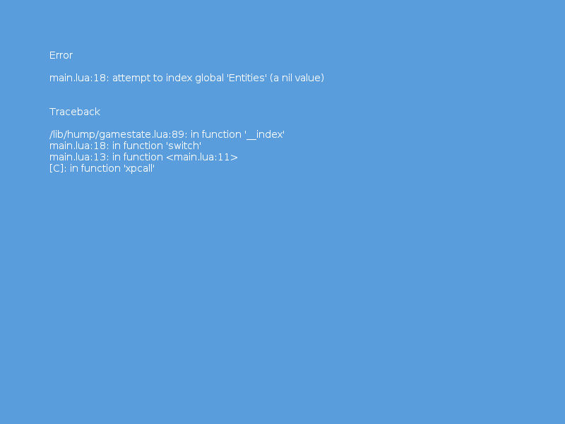
have been looking at this trying to figure out why a skeleton framework wont work..
Code: Select all
gs = require(".lib.hump.gamestate")
lg = love.graphics
local menu = {} -- previously: Gamestate.new()
local game = {}
function menu:draw()
lg.print("Press Enter to continue", 10, 10)
end
function menu:keyreleased(key, code)
if key == 'return' then
gs.switch(game)
end
end
function game:enter()
Entities.clear()
-- setup entities here
end
function game:update(dt)
Entities.update(dt)
end
function game:draw()
Entities.draw()
end
function love.load()
gs.registerEvents()
gs.switch(menu)
end
Code: Select all
gs = require(".lib.hump.gamestate")
lg = love.graphics
local menu = {} -- previously: Gamestate.new()
local game = {}
function menu:draw()
lg.print("Press Enter to continue", 10, 10)
end
function menu:keyreleased(key, code)
if key == 'return' then
gs.switch(game)
end
end
function game:enter()
gs.Entities.clear()
-- setup entities here
end
function game:update(dt)
gs.Entities.update(dt)
end
function game:draw()
gs.Entities.draw()
end
function love.load()
gs.registerEvents()
gs.switch(menu)
end
As a sanity check I went back to the wiki and tried the example code, surprise surprise...
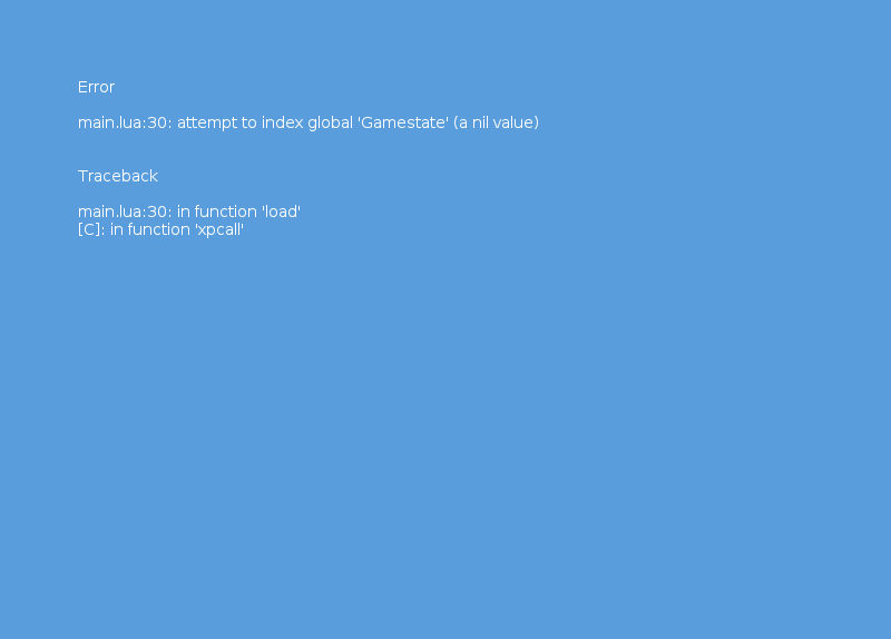
Code: Select all
require "lib.hump.gamestate"
local menu = {} -- previously: Gamestate.new()
local game = {}
function menu:draw()
love.graphics.print("Press Enter to continue", 10, 10)
end
function menu:keyreleased(key, code)
if key == 'return' then
Gamestate.switch(game)
end
end
function game:enter()
Entities.clear()
-- setup entities here
end
function game:update(dt)
Entities.update(dt)
end
function game:draw()
Entities.draw()
end
function love.load()
Gamestate.registerEvents()
Gamestate.switch(menu)
end
Who is online
Users browsing this forum: RetroKevin and 5 guests