Page 2 of 8
Re: New Icons
Posted: Sat Feb 13, 2016 6:23 pm
by Ranguna259
It looks good and really polished but I think it's kinda missing something.. Maybe the "funny" factor of LÖVE like two little eyes with a small smile or something like that, it looks too professional but maybe that's just me.
Re: New Icons
Posted: Sat Feb 13, 2016 6:38 pm
by slime
For comparison's sake, here are the old OS X and Windows icons:


Re: New Icons
Posted: Sat Feb 13, 2016 7:20 pm
by bobbyjones
IMO the new icons are more modern. Which is always nice.
Re: New Icons
Posted: Sat Feb 13, 2016 7:52 pm
by Ranguna259
The old OS X icon is really good, it has that "funny" element with it's pink color and with that nice relaxed font, on top of that, it's really modern and plain like Google's style guidelines (
material design).
Re: New Icons
Posted: Sat Feb 13, 2016 8:56 pm
by T-Bone
Yeah, this is really nice!
Re: New Icons
Posted: Sat Feb 13, 2016 9:03 pm
by tuupakku
I just noticed, you probably should update the favicon too.
Re: New Icons
Posted: Sun Feb 14, 2016 4:02 pm
by qaisjp
Lovely

Re: New Icons
Posted: Sun Feb 14, 2016 6:21 pm
by kikito
I approve this! I like that the app icon is more similar to the .love icon now (yet different).
Re: New Icons
Posted: Sun Feb 14, 2016 6:45 pm
by Ranguna259
Heads up, the wiki's favicon also needs updating.
Re: New Icons
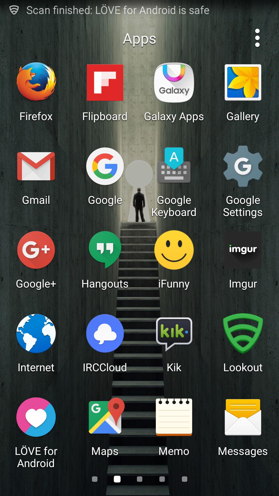
Posted: Sun Feb 14, 2016 6:48 pm
by bobbyjones
To copy slime here is the new icon on my Android device.
Edit 1: removed image.
Edit 2: added it back