True, thanks for the spelling heads up. not sure why the spell checker didn't find that out when I was googling haha - well that goes some way to explaining why most rpgs abbreviate the stats to three characters.
RPGs kind of have a rep of having some of the worst user interfaces and menu layouts of all games (outside of simulators) So I wanted to get the interface at least ok before moving onto the game. While nobody is going to play this its still useful to have a decent ui and menu system for future projects i think. I noticed that bad UI seems to follow game creators across projects.
With the weird issues I was having trying to get multiple libraries to work together I ended up focusing on the individual scenes. So stuff like the intro, outtro, menu scenes tended to come up first. Plus I figure if I can nail the menu and ui then I can use that with some tweaking across many projects so its got a lot of "bang for buck".
gauge style for stats, well its a bit cluttered - one of the interesting things with a traditional RPG is you have so many statistics to get across some how. You could take the route many classic RPGs did and just have walls of text and numbers (looking at you majority of 80s RPGs)..
Its like most of these games you end up learning the interface and not being able to use it naturally or with minimal clicks.
One thing I hated with games was useless busy work, I want to minimise that as much as possible (like having to manually select characters with abilities to apply a skill thats obviously needed - like for example the cleric healing people after combat assuming they have enough mana/prayers left.. why not just have the computer handle that for the player. Like who does not want to cure debufs after combat if they are able...
Seems that a decent macro system is needed but that will be a fair bit of work. But would be worth the effort.
Getting back to the character sheet/screen. Been thinking to splt it over a series of pages, so you get a breakdown of the characteristic and what it does in the game ect... I always found that lacking especially in things like skill trees. You end up either having to know D&D or be using a gamefaq to figure out how to allocate skills in a game. I figure that should be explained better by most games I have seen.
I guess the reason why these things usually don't get done is its a lot of work on a boring part of the project for most games. Nobody wants to be the guy that spent 6 months designing a character creation screen for a game that never got played.
Point taken about the tack meters - having slept on it I want to keep the circular theme but use something a bit more abstract more like you were looking at an information graphic. I figure that would be pretty cool and might have more of a chance of getting across the information more clearly to a player. Its also something I can do in inkscape, so thats a plus.
The best character creation menu I can remember was star wars galaxies. Haha I can remember that blew my mind when I saw it the first time - just the way you could customize the character ect.. I have been trying to think of a way to try and fake that in 2d as my machine does not have a dedicated graphics card it kinda rules out the current 3d model apps.
[youtube]https://www.youtube.com/watch?v=phB4-txo8VI[/youtube]
(start watching at 4 mins and 38 seconds to see the character creation.
But nostalgia being what it is, I notice that the swg interface is very text heavy.
Was thinking more along the lines of...
so each attribute has its own extra information that explains what it does in the game and why its important, what classes use it the most ect...
UPDATE:
So fast-forward a few hours.. whadayathink?
My projects and demos
-
pedrosgali
- Party member
- Posts: 107
- Joined: Wed Oct 15, 2014 5:00 pm
- Location: Yorkshire, England
Re: My projects and demos
Looks better to me than the previous one, a bit sleeker. I think maybe have an extra button on the bottom like 'all' or 'overview' so you can have just one screen to look at in a hurry that just shows all your stats then the individual tabs for when you need clarification. Also maybe a bar on each screen to show the actual stat.
Just suggestions, I think the style looks good though. Look forward to playing this one.
Just suggestions, I think the style looks good though. Look forward to playing this one.
Code: Select all
if not wearTheseGlasses() then
  chewing_on_trashcan = true
endRe: My projects and demos
Hi Pedro, thanks for the suggestions. Have been trying to figure out where to put the actual stat I am thinking of putting it in the bottom right hand corner of the text window.
These screens are a "More Info" screen that you would click if you wanted to know more about a statistic. The screen that you would do this from would have an overview of all the stats. So that's where you would see the general overview. Really these more in-depth screens are for guys that want to min/max or new people that are not sure of what the stats do ect...
The back button is going to be along the top right think, with the icon saying go back. will add that in later.
I found the xbox360 icons, will look for some keyboard ones later as not everyone is going to have a gamepad. but that's little nitpick stuff haha.
The other thing I am not so sure about looking at it again is the text size of the button prev & next is a bit on the small side.
Finally I have justified the text and now I am not sure if that's hurting the readability. I might just set it back to left justified.
The more I think about it the more players should be able to arrange there stats how they want to get the character they desire. that's fairly straight forward to implement, just swapping the data round in the table.
Think I will do a double linked list to handle the screen loading, so that's going to be a technical thing to look up for tomorrow as I am a bit rusty but luckily I got a warcraft mod book of all things with a section on how to do a linked list in lua so doing a double wouldn't be that much of a stretch I think.
This is the linked list...
This is the Reflexes screen. I got to add in that back button to the overview screen. But aside from that its finished (except for the actual stat. in the bottom right corner also .. but that will get fixed tomorrow.
Hopefully I can speed up the work-flow a little tomorrow and get most of the characteristics finished. I'll make a tech demo after that so this part of the menu at least should be working by mid week I think.
These screens are a "More Info" screen that you would click if you wanted to know more about a statistic. The screen that you would do this from would have an overview of all the stats. So that's where you would see the general overview. Really these more in-depth screens are for guys that want to min/max or new people that are not sure of what the stats do ect...
The back button is going to be along the top right think, with the icon saying go back. will add that in later.
I found the xbox360 icons, will look for some keyboard ones later as not everyone is going to have a gamepad. but that's little nitpick stuff haha.
The other thing I am not so sure about looking at it again is the text size of the button prev & next is a bit on the small side.
Finally I have justified the text and now I am not sure if that's hurting the readability. I might just set it back to left justified.
The more I think about it the more players should be able to arrange there stats how they want to get the character they desire. that's fairly straight forward to implement, just swapping the data round in the table.
Think I will do a double linked list to handle the screen loading, so that's going to be a technical thing to look up for tomorrow as I am a bit rusty but luckily I got a warcraft mod book of all things with a section on how to do a linked list in lua so doing a double wouldn't be that much of a stretch I think.
This is the linked list...
Code: Select all
local head = nil

head = {next = head, value = "Intelligence"}
head = {next = head, value = "Reflexes"}
head = {next = head, value = "Cool"}
head = {next = head, value = "Technical Ability"}
head = {next = head, value = "Luck"}
head = {next = head, value = "Attractiveness"}
head = {next = head, value = "Movement Allowance"}
head = {next = head, value = "Run"}
head = {next = head, value = "Leap"}
head = {next = head, value = "Empathy"}
head = {next = head, value = "Humanity"}
head = {next = head, value = "Body Type"}
head = {next = head, value = "Carry"}
head = {next = head, value = "Deadlift"}
head = {next = head, value = "Save Number"}
head = {next = head, value = "Stun Saves"}
head = {next = head, value = "Death Saves"}
head = {next = head, value = "Body Type Modifier"}

local entry = head

while entry do
  print(entry.value)

  entry = entry.next
end
Hopefully I can speed up the work-flow a little tomorrow and get most of the characteristics finished. I'll make a tech demo after that so this part of the menu at least should be working by mid week I think.
Last edited by Pangit on Sat Jul 02, 2016 2:35 pm, edited 1 time in total.
-
pedrosgali
- Party member
- Posts: 107
- Joined: Wed Oct 15, 2014 5:00 pm
- Location: Yorkshire, England
Re: My projects and demos
I think bottom right for the stat would be good, centralised they might look odd with the back button where it is.
Is this a Cyberpunk RPG? I saw the word Netrunner and that got me excited, I used to play tabletop Cyberpunk many moons ago. Good times.
*Edit: You mis-spelled Corporate on the INT screen.
Is this a Cyberpunk RPG? I saw the word Netrunner and that got me excited, I used to play tabletop Cyberpunk many moons ago. Good times.
*Edit: You mis-spelled Corporate on the INT screen.
Code: Select all
if not wearTheseGlasses() then
  chewing_on_trashcan = true
endRe: My projects and demos
Yes! that's well spotted. I enjoyed that game very much back in the day so I wanted to make a game 'inspired by/influenced ' the system.
I got bored waiting for cyberpunk 2077 - I wonder if it will ever be released it always seems to be delayed. So I thought, it would be nice to have a cyberpunk style game. in the meantime. Lol just with no budget, no 3d engine.
I figured I would do a hub world design just make a simple dungeon crawler first. That way I get the menus done, a combat system, the inventory, the NPCs ect all in the bag. Get the most simple game I can make done first then if I get that far start adding more complicated features.
I will need to change the character class names but the mechanics I think were pretty good - at least combat with automatic weapons is much faster with a computer than trying to work out all the initiatives and bullet damages by hand with dice haha.
The spelling mistakes are a bit of a headache - I will need to run it through the spell checker in a word processor before putting it into inkspace lol I am not so good at spelling.
-
pedrosgali
- Party member
- Posts: 107
- Joined: Wed Oct 15, 2014 5:00 pm
- Location: Yorkshire, England
Re: My projects and demos
Lol it was netrunners that held the game up for us, half an hour of roleplay just to open a locked door!
Good luck with this project, should be a real blast from the past.
Good luck with this project, should be a real blast from the past.
Code: Select all
if not wearTheseGlasses() then
  chewing_on_trashcan = true
endRe: My projects and demos
Thanks, yea Netrunning really did slow down the whole game. I remember that also. I think again its a area where if the computer is handling the majority of the rolls ect it should speed things up a fair amount. When you see games like Deus ex and how they handled it I think they must have played cyberpunk its so similar.pedrosgali wrote:Lol it was netrunners that held the game up for us, half an hour of roleplay just to open a locked door!
Good luck with this project, should be a real blast from the past.
As far as screens go I got the Cool screen near complete. Lol - finding art assets that have the correct licence that somehow fitted what the text said was easier said than done.
If anyone reading this finds any public domain or images with creative commons licences that you think would fit any of the statistics please feel free to post them here. It would help a whole bunch.
Have been looking into the technical side also in how to handle the code - as I talked about last night and in the support thread. So my time was somewhat divided today. On the plus side I did get to refresh my rather rusty understanding of how stacks, ques, lists ect work. So its all good.
While I was looking for an image to use for the Cool screen - I found some awesome vector image of nixie tubes to use for the room access panel. Will save that for when creating the character statistic screens starts to break me.
. This was my initial idea - I have to do the shading and do some 80s styling to make it look a bit more polished. Was torn between using LCD font or the nixies. now I look at this the nixie tubes might not have been such a great idea..
Enough of my yak yak.. here is the fruits of today's labour. - As you can see I am starting to think that the statistic heading should stay on the left - rather then centred. but I am still flip flopping on this issue..
Re: My projects and demos
So a new day a new screen, progress today has been pretty good. Found nearly all of the background illustrations that will be used in the characteristics screens (but if anyone reading this finds something they think would be good - please feel free to add them to the thread.)
Some more nitpicky things I have changed to the UI, your notice that the red highlight of the character class/profession now is a little bit more legible - I added a black outline. Not sure if that's the right track but will see how I feel later. What do you guys think? its more legible when the red text has a black outline or just naked?
Kinda got a little sidetracked doing the access panel last night, I am still not happy with how that turned out - I want to work more on the materials used. Sort of preferring the rotary selector/encoder. As I can do a neat animation in love with that and it will set it apart from most other games where you have security access screens.
Believe it or not rotary encoders used to be used for these kinds of applications back in the day.
Here is the Technical Abilities screen.
And here is the Luck screen.
Re: My projects and demos
Can I start forecasting a good shadowrun-like demo coming already? 
Re: My projects and demos
It's main influences RPG wise are probably going to be a combination of Cyberpunk 2013/2020, Paranoia and as you say Shadowrun.. There was one more that I can't think of right now that used to be popular back in the day..4aiman wrote:Can I start forecasting a good shadowrun-like demo coming already?

Cyberpunk 2013/2020 was a tabletop rpg that really should have been more popular. One thing that held it back was its rule system is fairly complex to actually play. Certain professions can be a huge time sink if you are doing a paper and pencil roleplay group. (that's why netrunners were often disallowed as playable characters in some groups.) What I realised was if these rules were handled by a computer a lot of the problems with the tabletop system go away...
The thing to keep in mind about Cyberpunk 2020 is its a vision of the near future from the 80s. So if you like films like Running man, Total Recal, Outland ect.. you would probably like the Cyberpunk setting.
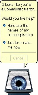
Paranoia's computer always used to crack me up.
PC game wise one of my fav games was Darklands, I figured do the town hubs like they did as that was a pretty creative way to handle things without getting to boring. The main thing I took from an interview with the creator I listened to a few years ago was that he wished that Darklands was a truely scripted game, so it would have been easy to do updates and upgrades. As it was hard-coded it made doing expansions extremely difficult. So I promised myself then were I ever to write a game I would make sure it was scrip-table and modular.

Of course I really enjoy the usual games like Dragon Quest, Phantasy star, Etrian Odyssey ect... The only thing that bugged me about them was they were quite repetitive and overly simplistic. But parts of them I liked like the simple interfaces ect.. What I took from this was really work hard on making the interface and controls logical to use. But on the other hand I wanted to give a player the opportunity to avoid grinding for xp unless that was there joy in the game. Like there has to be quests as an option for people that don't want to kill thousands of slimes.
The main thing about games like Dragon Quest and Phantasy star was I knew something like this could be done in around a year of work realistically by one person. That seems a reasonable goal. It's not like I am saying "I want to make a game like Morrowind, Witcher 3 or Deus Ex.."
But one of the oldest games that heavily influence how I wanted to make the game was Melbourne house - The Hobbit. Back in the day that was my fav. Spectrum game. The way that every time you played the NPCs had there own lives and independent actions that varied from play session to play session. And this was a game from 1982. I really enjoyed games where it felt like the world had its own agency and the NPCs had there daily routines ect.. I think that gives a game a great deal of depth and added playability. In a game like the Hobbit, it didn't take a whole lot to give that impression and greatly expand the appeal of a game running on a computer with 48k of ram lol.

But I knew that the interface design had moved on since 1982, nobody really wants to play text adventures - even graphic ones anymore. Its somewhat of a dead game type (with the exception of a small dedicated fan base.) But if you read this thread you already saw the biggest barrier to me doing a text adventure - I can't spell.
It was hard to find a balance between a game that would be enough of a technical challenge to pull off and something that would not be so unrealistic for one person to complete.
The main thing is getting the game engine working, and a functional interface. Once that is done - assuming i can pull it off you could just implement what mechanics you wanted depending on what data was loaded.
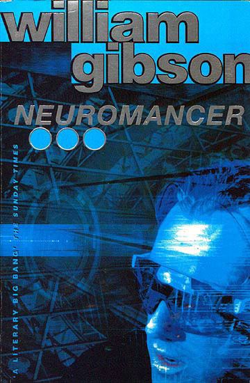
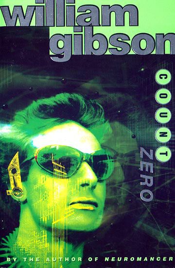
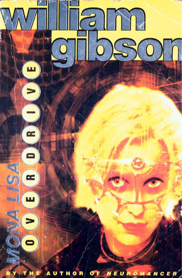
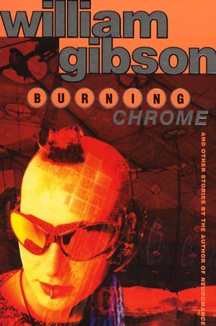
Growing up I really enjoyed the sprawl trilogy (but there were 4 books lol..). Its a great setting for a game. It heavily influenced games like Deus Ex, and also table top roleplay games like Cyberpunk 2020 and shadowrun to a lesser extent.
I guess story wise - I haven't really considered that, most important thing is getting a working engine. But of course I like the books of William Gibson so no doubt the type of world setting will be like that of necromancer. That should make for an interesting game thats distinct enough from its influences to be interesting I think.
Update:
Now have a technical demo for this tiny portion of the partially complete character statistics menu screens that works with the gamepad, the keyboard and by tomorrow the mouse. Also has functioning sound fx, music with user controlled volume levels & a mute function (fancy stuff I know.. lol.). Will upload when I have the mouse inputs done. (and it will give me a little more time to finish the rest of the screens.) So all in all a good day. Randomly TEmusic seems to be behaving just fine on its own. will start adding more libraries and see where it starts to go to pieces. Will give everything the once over with the spellchecker and hopefully avoid any more mistakes.
Who is online
Users browsing this forum: No registered users and 1 guest